Then (below the jump) I'll talk more about the effect of removing seasonality,. It is substantial, and, I think, instructive.
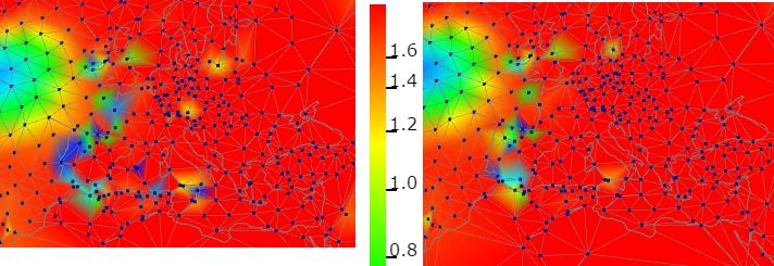
First I'll show Europe - unadjusted on left, adjusted on right. All images here are of the thirty year period from 1987 to 2016. It shows a pattern typical of most of the world, with a large degree of uniform warm trend, with a few exceptions. The cool blob on the left, in the N Atlantic, is a shadow of a more prominent cooling in that area in more recent years. The effect of adjustment is not so radical, but it does reduce some of the excursions, some almost fully. It's possible the excursions were real, but given the general uniformity, it seems more likely that they were inhomogeneities.
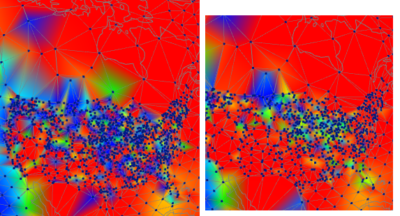
Next is the USA, with some of Canada in contrast. The density of stations is obvious, as is the inconsistent but strong cooling trend. The issue is TOBS. A lot of stations changed with the conversion to MMTS, and the canges were generally in a direction that created artificial cooling. With adjustment, which includes TOBS correction, the picture is much clearer. Still some cooling in the mid-west, but otherwise warming, as in the rest of N America.
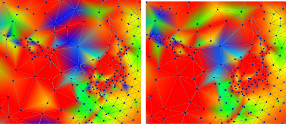
Finally, China. The stations are sparser, but again fairly irregular, although te denser regions are more consistent. And this time homogenisation does not make a cosistent warming or cooling change. It does moderate some of the extreme cooling, so that might have a warming effect overall.
Finally, I would urge readers to check the page in detail, to see the overall effect of adjustment (the swap button helps here). The main thing to see is that adjustment does not have a general effect of increasing trends. It's true that it is hard to distinguish shades of red, but at least warm trends are not being created out of nothing.
Below the jump I'll deal with the seasonal issue.
As I said in the previous post, it is important to remove the seasonal oscillation before calculating trends, even for single stations. With the global aggregates that I normally show, this is done automatically as part of the anomaly process. But in the special case of station trends, I didn't do this, and I'll show what the consequences were with a sequence of histograms.
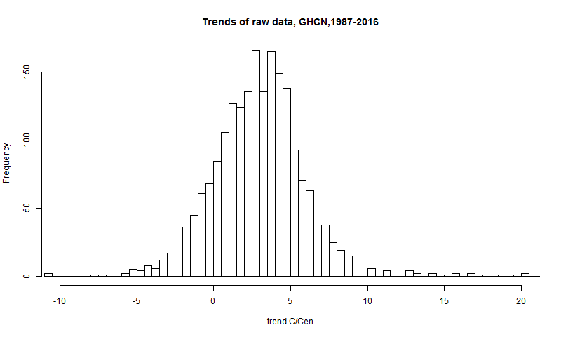
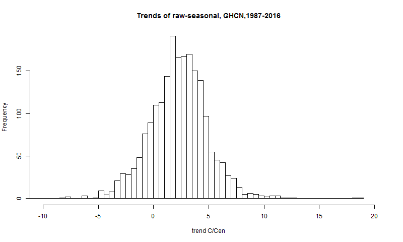
The first is of the raw data, just doing OLS regression on the monthly data. I am looking at 1987-2016 OLS trends, and plotting here just the land stations (GHCN V3 monthly). SST has rather less seasonality, and is less likely to have missing data.
Then I'll show the trends I get by replacing the data by just the periodic seasonal averages for the whole period of the station. Being periodic, this should have no trend, except for possible artifices at the endpoints. The trend that does emerge is partly that, and partly the effect of missing data. It is in effect the error trend:
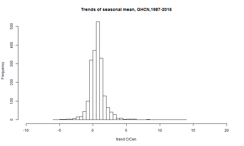
It's on the same scale, so the errors are small relative to the general spread, but not nothing, and in some cases are quite large. Finally, I'll show the histogram of the trend with seasonal subtracted, which is what I now use:
It is a little more compact than the raw. There is also a bias in mean. Raw was 2.95 C/cen, the error mean is 0.661 C/Cen, so the final mean is 2.28 °:C/Cen. I emphasise again that there are no such errors in the anomaly averages I normally talk about.
I'll just mention an extreme case where this had a big effect. Baker Lake is in N Canada (Nunavut), NW of Hudson's Bay. It has a big seasonal change. The pattern of observations according to the NOAA page looks like this:
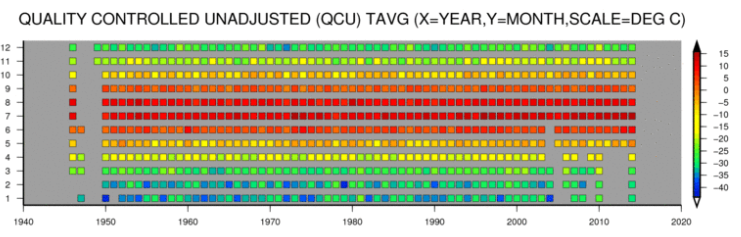
It's the worst case - missing data at the recent end, and mostly in winter. That pushes the trend right up, unless corrected. The raw trend was 22.44 C/cen, the trend due to seasonal alone was 13.83 C/Cen, and the trend after subtraction was 8.60 C/cen - still high, but it is a near-Arctic location.


I believe you said in the past that you preferred not to do any homogenization. Have you reconsidered that? Seems like there is still room for improvement, at least over NOAA's methods.
ReplyDeleteCCE,
DeleteI wouldn't tackle homogenization myself. I use unadjusted results basically to show it makes little difference in aggregate, but I do think it is better to homogenize. I think these plots do a good job of showing up inhomogeneities, and the extent to which homogenization fixes them (less than total). But I'd be wary of overdoing it. The basic need is to counter bias in the global (and regional) average rather than get perfect smoothness.
Not so much of a problem today but more significant in the past when coverage was poor. But I guess with less stations, locating discontinuities becomes more difficult. But with all of the independent sources and measurements available today, getting really good homogenization methods would at least improve error estimates of the older data. Correlation between SAT, MSU/AMSU, Radiosondes, Ships, Buoys, AVHHR. Correleation by distance, region, biome, etc. Lots of different ways to take everything that we do know, and constrain what we don't know.
Delete