AveT = sum_R(w*r)/sum_R(w)
which is the average T for region R, and
Contrib_r = sum_R(w*r)/sum_G(w)
which is the proportional contribution R makes to the global T. That means you can see how those contributions add. So instead of saying it was cold in N America, you can see just how much that cold pulled down the global average.
Below the fold I'll show both of those for continent-sized regions, and also the ocean, for the months of 2015. Note that they are not exactly sums over the continent areas, but over the areas that are assigned to nodes within the regions. Each month has a different mesh, so these area assignations vary slightly - I'll show a third plot to quantify that. Of course, the regions don't change (except for ocean freezing), so to the extent it otherwise varies, it's an error.
I'll show how you can see what exactly contributed to the ups and downs of temperature this year.
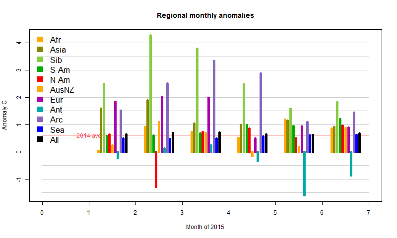
The regions are Afr=Africa, Asia (without Siberia), Sib=Siberia (Asiatic Russia, code 222), S America, N America, AusNZ=Oceania, Europe, Ant=Antarctica, Arc=Arctic>65°N, Sea=SST, and All=Global. I follow the classification of the GHCN country codes, for which 100-199 is Africa etc. Arctic stations are removed from N Am and Sib.
Here is the plot of monthly regional averages. Land regions are very variable compared to Sea and Global. But they are mostly minor components of the sum, and the next plot will show that in perspective. Features are the famous N American cold of February, recent cold in Antarctica, and Feb/Mar warmth in Asia/Siberia. You can also see the Arctic warmth in March/April, which led to early melting.
Now here is the version weighted as contributions to the main sum, which is more informative. The black is the sum of the colors.
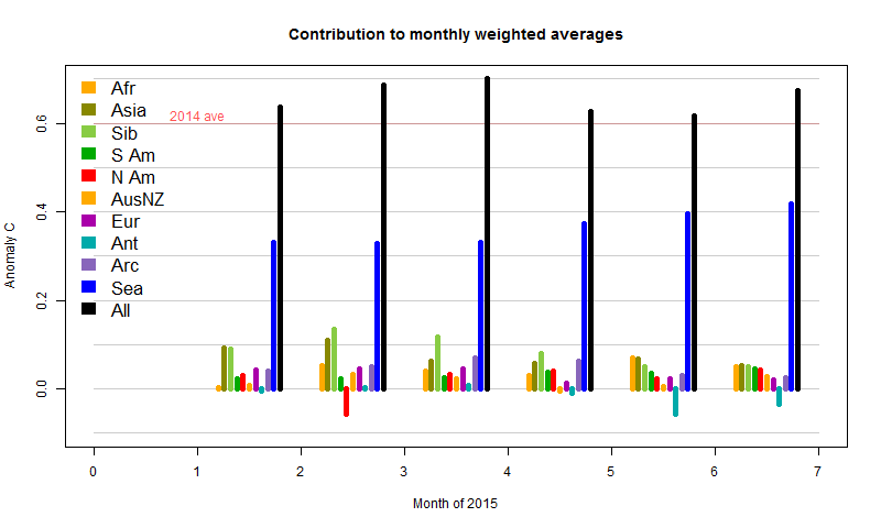
Firstly, SST has been gradually increasing, which pushes the total up significantly, without showing month-month fluctuations. Then you see the sharp cold spell in February N America. It has a small reducing effect, almost countered by a rise in Africa, and dwarfed by the warmth in Asia and Siberia. Consequently, Feb globally was a lot warmer than Jan, despite that cold much remarked on blogs. In May/Jun and even Apr, the cold in Antarctica had an effect, which, with the subsiding warmth in Asia/Siberia, is responsible for later cooling.
Finally, I'll show the variation in weights. There isn't much; I've shown 10x bars faintly over the land regions to make the effect more visible.
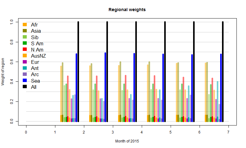
The exception is Antarctica, where the sea ice has been growing. Since that is then excluded from the SST component, land stations carry greater weight as the ocean recedes. The Arctic behaves irregularly. This reflects the fact that the mesh there is sparse, and has a degree of randomness in its response. It reflects the limits of this measure. Still, it's a minor effect overall.
I'll probably incorporate this analysis in the ongoing latest data.


0 comments:
Post a Comment