HADCRUT gathers temperature anomalies each month in a 5°x 5° lat/lon grid. Where gridcells have no data, they are omitted. As I said then, this is not a neutral decision. Whenever you average over a continuum with fixed divisions and have missing values which you omit, that is equivalent to replacing those points by the average of the data you have. That is often not a good choice, and if there is anyway of better estimating the missing values, it should be used. I did my own analysis of coverage here and here.
C&W use a quite elaborate scheme for deriving those infills, involving satellite data and kriging. I wondered how much could be achieved by a very simple improvement. The main bias is believed to be latitude-based; specifically, that polar regions behave differently to the rest. So I sought to replace the missing cells by a latitude band average rather than global. I'm not using kriging or satellite data.
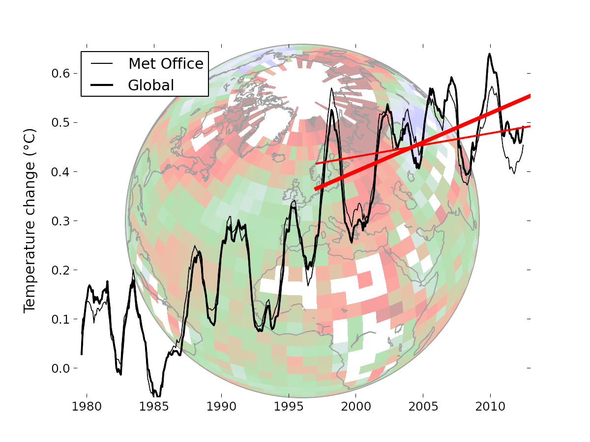
I think this is useful because the new paper has been greeted as a "pausebuster" because it shows a much less reduced trend in recent years. So I'm focussing on the 16 year global trend since Jan 1997 (to end 2012), also treated in C&W. I think a simple demonstration of the coverage correction would reinforce C&W's much more thorough and elaborate treatment.
Coverage and latitude averages
This image from the C&W site gives an idea of the coverage issue. There is a lot of missing data outside the polar regions, but it is not clear whether that biases the trend. But the polar regions are warming rapidly, and to in effect treat the missing cells as global average does create a bias.
I formed a latitude average for each month for a 5° band using the following weighting rules. Cells in that band with data have weight 1. Cells in adjacent bands have weight r, where r is typically 0.1-0.2. Cells in the band adjacent to that have weight r^2. Others are not used.
The point of this is that where there is good coverage, the average will be close to the band average. But if the central band has few data cells, the adjacent band cells, though downweighted, will be more significant by their numbers, avoiding the high variance that would come from relying on just the few cells in the central band. And if both those bands have few entries, then the third level comes into play. This is really only relevant to the N pole band, where the two bands above 80° are sparse.
I then simply infill missing data for each month with the latitude band average value, and compute trends for the resulting complete set.
I expect the result to vary little with r - this will be shown.
Results
The trend over the period 1997-2012, in °C/decade was:| HAD 4 cited C&W | 0.046 |
| HAD 4 with global average infill | 0.0539 |
| HAD 4 with lat av infill r=0.05 | 0.0854 |
| HAD 4 with lat av infill r=0.1 | 0.0846 |
| HAD 4 with lat av infill r=0.2 | 0.0821 |
| GISS cited by C&W | 0.080 |
| C&W hybrid | 0.1187 |
So this simple infill almost doubles the trend, but does not go as far as the C&W hybrid method. It is, however, close to GISS, which interpolates to avoid missing cells.
The graph by latitude band is

Here is a graph to show the small variations with different r (parameter for spreading estimate of latitude band average)


Your simple but judicious modelling contributes significantly to understanding and a better portrayal of reality. Nice work Nick!
ReplyDeleteThanks, Noel.
DeleteI'm guessing part of the remaining difference comes from the rebaselining. Using a baseline which is distant in time and norms from the trend period means that changes in coverage have a bigger effect on trends. Couple this with the fact that over the trend period HadCRUT4 land coverage declines and SST coverage increases. It works a bit like a product rule in calculus, with the terms being the contrast between the observed and unobserved regions, and the coverage mask. Both can change the bias.
ReplyDeleteAnother way to address this would be latitude averages of the land and sea data separately - I haven't tried this, but it might shed some light one way or the other. More generally I haven't come up with a good way of attributing causes of bias in the case of changing coverage.
Kevin
OK, I've now got some evidence that the increase in trend on rebaselining comes from reducing the impact of declining land and increasing SST coverage. (We originally had to rebaseline to match the satellite data.)
ReplyDeleteUsing the blended data, rebaselining increases the trend by nearly 0.02C/decade, and this increase survives through kriging. On the downside it means throwing away some observations because they don't have enough coverage on 1981-2010.
However, if I do separate reconstructions on the land and ocean data and then blend, the effect goes away and the results are similar whether or not you rebaseline. That is what you would expect if the rebaselining is mitigating the bias due to a shift in the land/ocean coverage balance. This is a strong additional justification for reconstructing the unblended data.
This should be trivial to do with your method too - with the exception that you then need to make an explicit decision about how to treat sea ice when you blend.
Kevin
Kevin,
DeleteI guess when you rebaseline you subtract a larger increment from the Arctic cells than average. And so for any such cell with intermittent coverage, you're effectively subtracting that larger amount from the data cells, and the smaller global average amount from the empties. That could create a trend.
I've found it quite useful to do the calculations that way. I noticed there was about a 0.05C.dec difference between the HAD 4 I gave here, and the one in your paper. I realised that HAD 4 is actually N+S. That means that when I substitute global average for data free cells, I should really substitute the hemisphere average. It makes a big difference, because the SH has almost twice as many empty cells, and a lower average trend. Using the hemi averages gets it right. But of course latitude averages make more sense.
In the same way, using land or ocean averages also seems better than not.
Not rebaselining the unblended data will be a huge benefit - for a start by not throwing away coverage we'll be able to do a plausible kriging reconstructruction back to 1850, although the uncertainty estimates will be more difficult.
DeleteUnfortunately I don't see any alternative for the hybrid dataset. You simply can't hybridize data on different baselines without introducing spurious bias. (I wondered about kriging, rebaselining and then masking down again, but I expect I can work out a case in which that fails.)
The HadCRUT4 trends in the paper were the official Met Office versions with N+S averaging. Hadley have bumped their version since the data we used in the paper, which has increased the trends slightly.