The GISS V4 land/ocean temperature anomaly was 1.39°C in March, down from 1.44°C in February. This fall is smaller than the 0.11°C fall reported for TempLS.
As with TempLS, March was the warmest March in the record - next was 1.35°C in 2016. It was the fourth warmest month of all kinds.
As usual here, I will compare the GISS and earlier TempLS plots below the jump.
Friday, April 12, 2024
Monday, April 8, 2024
March global surface TempLS down 0.11°C from February, but still warmest March in record.
The TempLS FEM anomaly (1961-90 base) was 1.174°C in March, down from 1.284°C in February. It was still the warmest March in the record, just ahead of 1.138°C in 2016. The NCEP/NCAR reanalysis base index fell by 0.097°C.
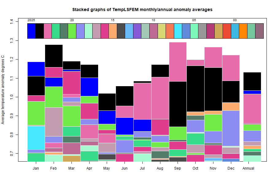
Here is the corresponding stacked graph, showing how much hotter recent months have been, as well as the now completed year of 2023:
Here is the temperature map, using the FEM-based map of anomalies. Use the arrows to see different 2D projections.
As always, the 3D globe map gives better detail. There are more graphs and a station map in the ongoing report which is updated daily.
Wednesday, March 13, 2024
GISS February global temperature up by 0.22°C from January.
The GISS V4 land/ocean temperature anomaly was 1.44°C in February, up from 1.35°C in January. This rise is larger than the 0.165°C rise reported for TempLS.
As with TempLS, February was the warmest February in the record - next was 1.37°C in 2016.
As usual here, I will compare the GISS and earlier TempLS plots below the jump.
As with TempLS, February was the warmest February in the record - next was 1.37°C in 2016.
As usual here, I will compare the GISS and earlier TempLS plots below the jump.
Thursday, March 7, 2024
February global surface TempLS up 0.163°C from January; warmest February in record.
The TempLS FEM anomaly (1961-90 base) was 1.256°C in February, up from 1.093°C in January. It was the warmest February in the record, ahead of 1.16°C in 2016. The NCEP/NCAR reanalysis base index rose by 0.061°C.
It was very warm in N America, most of Europe, and the Arctic. Cold patches in Central Asia and far NE Siberia. Antarctica was cold.
Here is the temperature map, using the FEM-based map of anomalies. Use the arrows at bottom to see different 2D projections.
As always, the 3D globe map gives better detail. There are more graphs and a station map in the ongoing report which is updated daily.
Here is the updated stacked plot of monthly values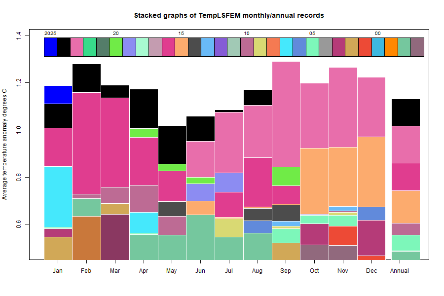
Tuesday, February 13, 2024
GISS January global temperature down by 0.14°C from December.
The GISS V4 land/ocean temperature anomaly was 1.21°C in January, up from 1.35°C in December. This fall is similar to the 0.165°C fall reported for TempLS.
As with TempLS, January was still by a small margin the warmest January in the record - next was 1.18°C in 2016.
As usual here, I will compare the GISS and earlier TempLS plots below the jump.
As with TempLS, January was still by a small margin the warmest January in the record - next was 1.18°C in 2016.
As usual here, I will compare the GISS and earlier TempLS plots below the jump.
Wednesday, February 7, 2024
January global surface TempLS down 0.165°C from December, but still warmest January in record.
The TempLS FEM anomaly (1961-90 base) was 1.062°C in January, down from 1.227°C in December. It was still he warmest January in the record, but only just ahead of 0.982°C in 2016. This is the first time since May that the month was not warmest by a long way. The NCEP/NCAR reanalysis base index fell by 0.141°C.
It was very warm in NE N America, but cold in a band from the Gulf Coast to Alaska. Cold in N Europe and far East Siberia, but a band of warmth through N Africa to central Siberia. Antarctica was cold.
Here is the temperature map, using the FEM-based map of anomalies. Use the arrows at bottom to see different 2D projections.
As always, the 3D globe map gives better detail. There are more graphs and a station map in the ongoing report which is updated daily.
Sunday, January 14, 2024
GISS December global temperature down by 0.06°C from November.
The GISS V4 land/ocean temperature anomaly was 1.37°C in December, down from 1.43°C in November. This fall is very similar to the 0.064°C fall reported for TempLS.
As with TempLS, December was still by a large margin the warmest December in the record - next was 1.16°C in 2015.
As usual here, I will compare the GISS and earlier TempLS plots below the jump.
As with TempLS, December was still by a large margin the warmest December in the record - next was 1.16°C in 2015.
As usual here, I will compare the GISS and earlier TempLS plots below the jump.
Subscribe to:
Posts (Atom)


